


ESPN fans voiced their concerns. They didn’t understand what ESPN+ was, what was included in the service, and overall they were confused about what they would gain from signing up. The following designs tackle those concerns head on.
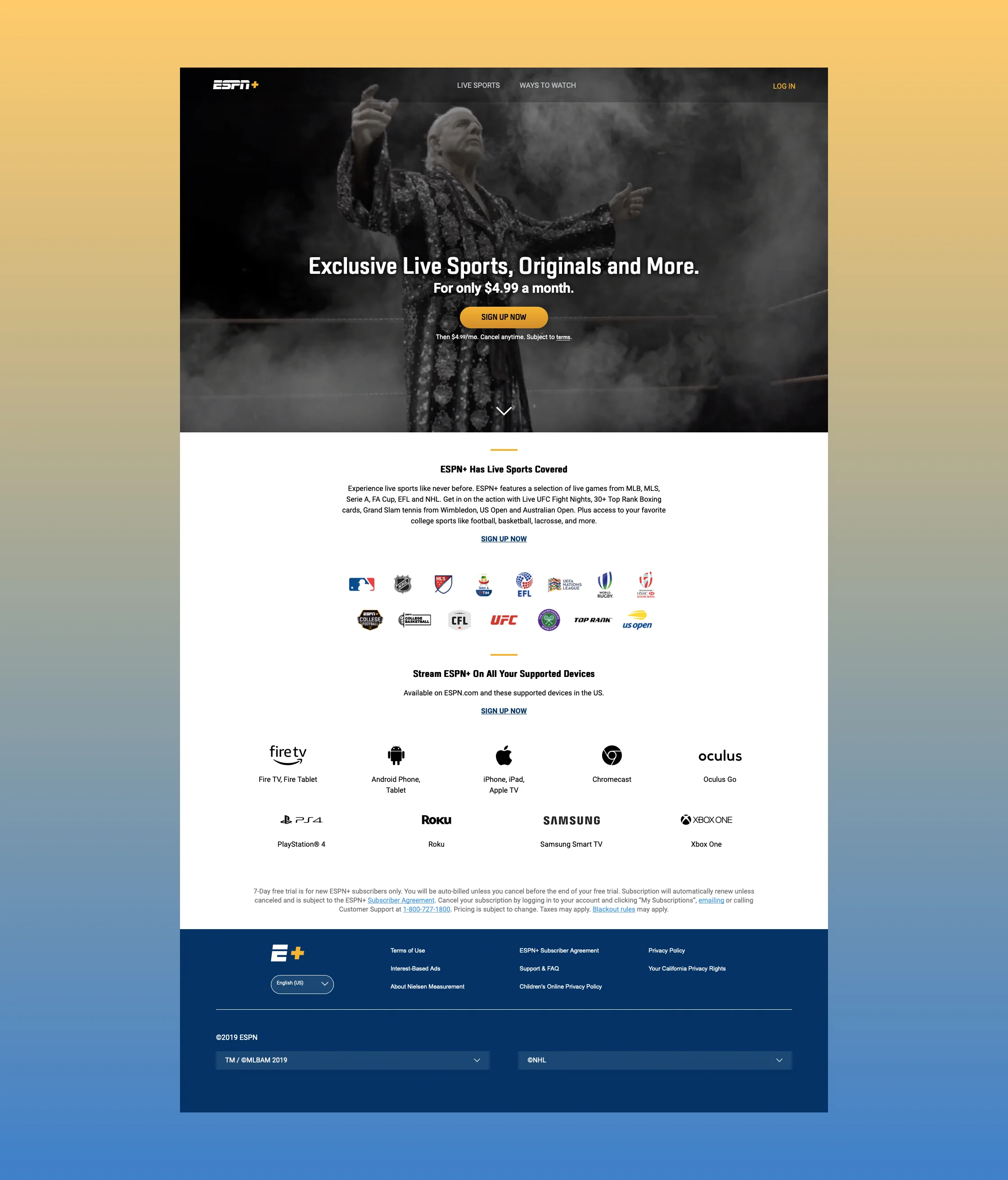
Using the original layout as a starting point (see below), I looked to create a more impactful approach to educate our fans with imagery that would resonate with sports fans.
Imagery is larger. Logos are used whenever possible. Big name athletes are called out and highlighted. I even tackled copywriting to help give simple breakdowns of benefits. This solution is modular and designed to allow each element to be replaced, updated, and re-ordered quickly and easily.
Shown as vignettes, each section focuses on rotating messages that display a single item at a time. This helps to emphasize a particular action, league, athlete and so on. This would allow for even more personalization as the items could be customized and re-ordered based on the what information we knew about the fan.